The World Record Club pty. ltd.,was a mail-order record distributor of mainly classical music, but also show tunes and jazz, and later Aussie bands such as the Seekers and Johnny Farnham. The company was originally set up in England in the late 1950s then an Australian division was set up and housed at 330 Flinders lane, Melbourne. The in-house art department was headed by Geoff Digby who directed and encouraged a constant influx of in-house and freelance designers, typographers, illustrators, photographers and artists to create exciting new sleeves for over 2000 releases.
Geoff Digby's design studio was possibly the first of it's kind in Australia, and it helped develop the fledgling profession of the Graphic Designer.
tbc
World Record Club
Looking at record jacket design from the World Record Club. A Melbourne based, mail-order record distributor from the 1960's and 1970's
Tuesday, 30 November 2010
The beginning
History
A few weeks ago I was searching an op-shop for Pelican books as I usually do.
But on this particular day I decided to check out the records, too.
In fact I had pretty much given up searching the op-shop shelves and crates of scratched, dusty old records a long time ago, but out of the shear lack of anything better to do I casually had a flip through. After digging around for a while amongst the usual suspects of op-shop vinyl: Kamhal; Engelbert Humperdinck etc, I began to notice some striking sleeves and started to pick them out. Each one stood out from the the bunch because of its bold typography, its economical use of 2 or 3 colours, and its simple illustrations or prints, or its use of colour-overlaid black and white photography.
I began to see there was an overwhelming amount of records (perhaps around 50), and also began to spot the same little logo on them all – a little figure 8 shaped symbol of a record stacked on-top of a south pole centric globe, on the flip side the name: World Record Club. A Google search led me to Geoff Hocking's website.. and the rest is history.
Ways of seeing
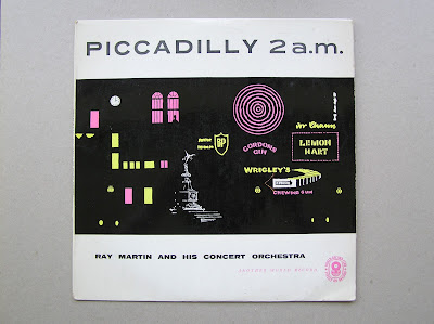
I realised that I had probably been seeing these records for years, without actually seeing them, due mainly to the fact I was used to looking for records of bands I recognised. This was confirmed when I returned home, where on checking my record collection I pulled out five WRC records. I had originally picked these records out because the music or content interested me, not necessarily because of the design. With the exception of one, Piccadilly 2.a.m, Ray Martin and his concert orchestra (below). I found this record years ago and bought purely for it's lovely early 1960s design and it's sparse illustration of the lights of London's Piccadilly Circus. This was my first World Record Club record, and I didn't even know. But that design spoke to me back then, as they all do now in their own individual way. It's amazing that so many styles can still unify to create a consistent identity. I can flip though the records in the shops now and immediately pick out the WRC ones. Just as I scan the book shelves for the familiar blue spine and friendly logo of Pelican books.
 |
| Piccadilly 2.a.m, Ray Martin and his concert orchestra |
Subscribe to:
Comments (Atom)